Key Takeaways
- Canva offers user-friendly templates for various uses, from flyers to social media, complementing programs like Microsoft Office.
- Utilize Positions for better design strategy, layering elements for more original images.
- Canva Pro provides valuable features like Brand Kits, Background Remover, and Magic Edits for enhanced document creation and editing.
I use Canva every day for work and my personal life. It’s convenient and user-friendly no matter your background in graphic design and image editing. It’s also incredibly price friendly, offering free account levels and Pro accounts features for no cost to non-profits and schools. My experience with Canva goes back to 2015, when I needed a free software solution for signage, social media, and marketing for the college library I worked for. I have used it consistently since at each of its membership levels, Free, Pro, and Team versions.
After 10 years of using the platform, I have some tips and tricks that every new and existing user should try out to up their Canva game and save them time in the editing process. Canva’s been my go-to application for everything from baby shower bingo, classroom handouts, and social media coverage.
Its intuitive nature, pricing, and astronomical growth over the last ten years shows its doing something that Photoshop isn’t — breaking down the barriers to creative software for greater access.
Canva is known best for its easy-to-edit templates covering anything from flyers, invitations, social templates, worksheets, and banners. Most public K-12 schools offer it as an option for students to hand in presentations, posters, and infographics now too, complimenting Microsoft Office and Google Drive suites for content creation. It’s expanded its service to cover background removers, a Magic Edit suite, AI generation, videos, and premium content in the last few years too.
It might not compete at the exact level of Adobe PhotoShop’s editing software, but its intuitive nature, pricing, and astronomical growth over the last ten years shows its doing something that Photoshop isn’t — breaking down the barriers to creative software for greater access.
1 Use Position when layering elements
You can arrange quickly and edit piece by piece
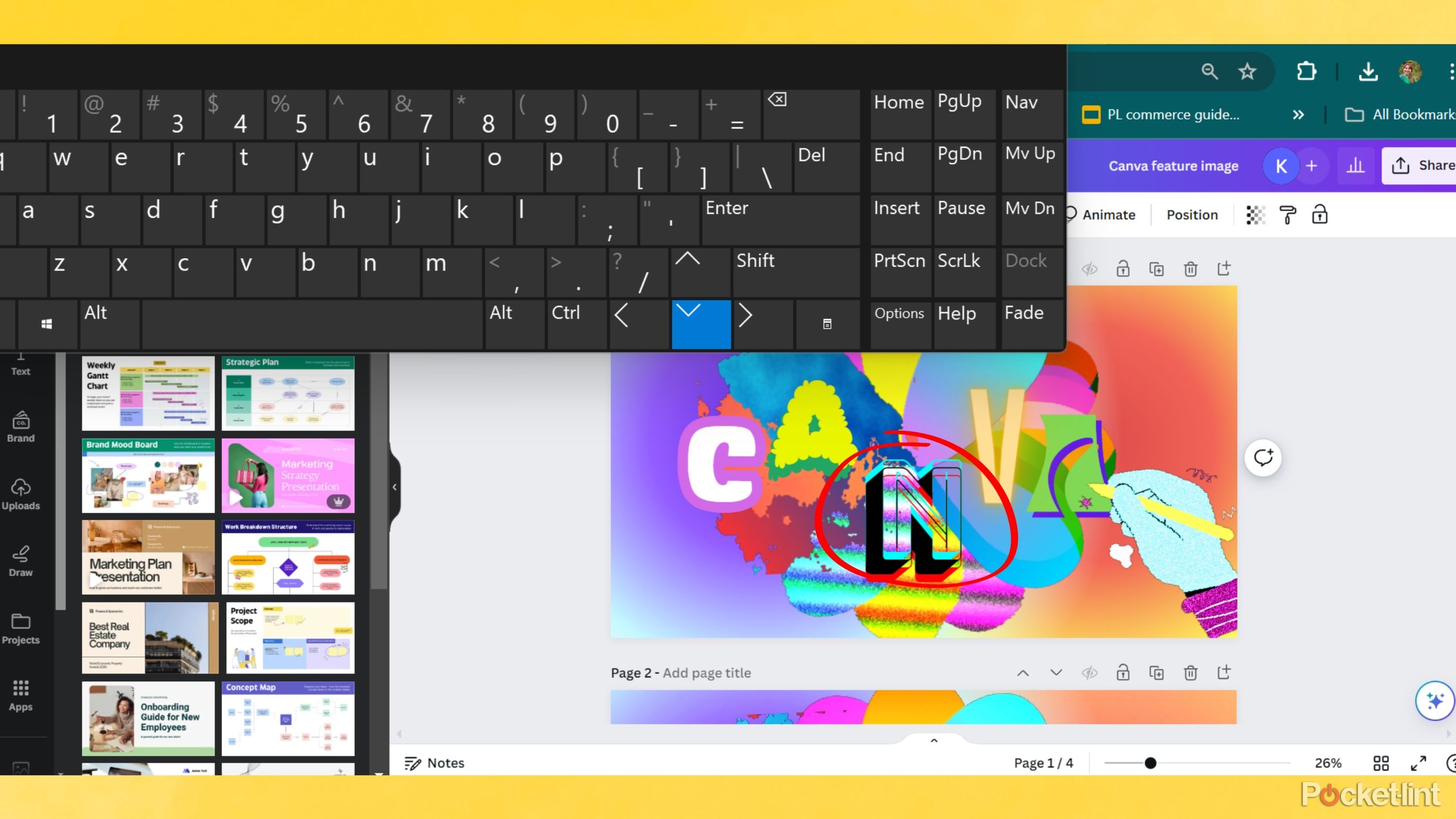
No matter the project you create on Canva, you are likely to use more than one element at a time. Without using the Positions tab you may become frustrated quickly. After selecting any element in the design, find the Position tab on the top selection bar and from there you have a few options that will save you time: Arrange and Layers.
This is my most used feature on Canva and saves me a headache anytime I need to move an element on a crowded page. Some errors you may encounter without using this feature include:
- Moving the wrong image
- Losing elements behind larger ones
- Leaving elements out of order
Utilizing positions also allows you to create more interesting, original images by combining elements and nesting images, whether that be graphics, photographs or video.

As a pro photographer, these are my favorite iPhone camera apps
These are the apps I turn to when I want to get the most from my iPhone’s camera.
2 Frames make using original images a breeze
Never worry about miss-matching and sizing
Frames will save your sanity and reduce the need to resize images with regulated proportions and easy drag-and-drop actions. From phone frames, to shapes, and freeform drawings, you can use frames to insert overlaid photos properly into designs. It saves you time finding the exact sizing you used in the last design you may have liked and helps loads when creating templates and social media posting.
To use frames in Canva follow these steps
- Go to Elements.
- Scroll down to frames or search for a specific term with the addition of the word frame.
- Find the frame style that best fits your needs.
- Click the frame style you like best and arrange it in your design.
- Go to Uploads or Canva Photographs in Elements.
- Add content from your files with a click or a simple drag and drop.
From Canva’s homepage, if you head to Apps, there’s a newer app for freeform frame design, ‘Frame Maker,’ that is perfect for designs that need customized frame proportions.

Best laptops for video and photo editing: 5 dream machines for working on the go
These laptops represent the finest for mobile editing, with fast processors, powerful graphics cards, brilliant displays, and plenty of memory.
3 Use Zoom and arrow keys to move elements
Unless you’re on a desktop with a mouse, click and drag can annoy
Positions and layers improve the design process greatly, but there’s another area of editing that is still a pain-point for many Canva users: dragging and dropping elements around a page for proper alignment. This tip is the simplest and will save as much time as using Positions. Some elements seem to jump across the page one click too far from where you intended to place it, stay calm, resist the urge to throw out your device out a window, and try this instead.
How to move stubborn elements on Canva with your keyboard
- Zoom in a bit closer to the element that needs moving.
- Select the element you plan to move.
- Use your keyboard arrow keys to maneuver stubborn elements rather than your trackpad/mouse.
My 5 must-try Photoshop tips to edit photos in 5 minutes or less
Photoshop is a powerful editing tool but it’s easy to get lost in all the different tools. Here are five tips for quickly editing your images.
4 Make your own templates to repeat styles
Teachers and social media managers — save yourself time
I use templates every day, if not multiple times a day. Examples of five of my favorite templates are found above. One of Canva’s selling points is that you can browse thousands of their provided templates to edit into your own designs. But the game-changing template feature I use most often is designating my own designs as templates.
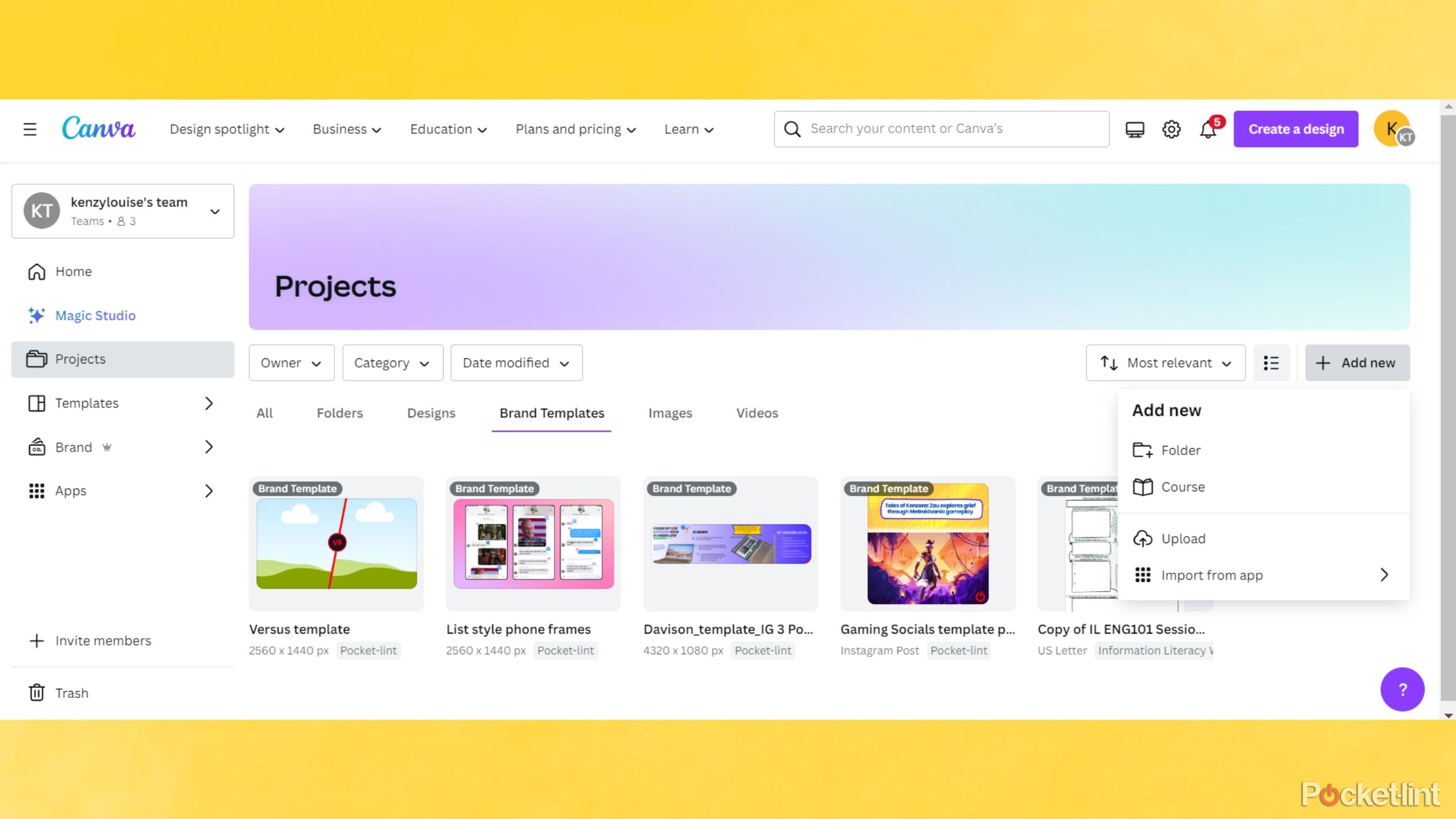
Canva allows you to turn your designs into Brand Templates or shareable template links. I prefer using Brand Templates (a Pro feature) and saving them in appropriate categories. For example, when teaching, I have a folder with my worksheet templates dubbed “Information Literacy,” and I’ll break that down further into subject areas needed. While for social media posts, I have folders for company name’s to keep things orderly. Brand templates are a part of the greater ‘Brands’ feature available through Canva Pro, which is another worthwhile feature I’ll explain below.
How to make a design a template in Canva
- Open a design.
- Go to Share in the upper right of the window.
- Select either Brand Template (to add to your templates) or Template Link (to share a template with others).
- If you choose Brand Template, choose where to save it.
- If you choose Template link, copy the link and send it to collaborators.
- Find your templates from the Canva homepage under Projects.
I highly recommend you use an organization system in Canva. The same way that it’s hard to find documents if they’re all labeled ‘document1.doc’ follows true for images too. Utilize folders and a naming system that works for you to get the most out of templates.

7 free Photoshop alternatives for quick and easy photo fixes
Fixing a photo or creating a graphic doesn’t always have to come with the price or learning curve of Photoshop.
5 Brand Kit settings for easy color and font access
Lock in quick access to hexcodes and font styles
Another Canva Pro content hack — get your organization’s color pallets and fonts loaded up ahead of time to make live editing a breeze. You can edit your brand settings in the Brand Kit settings from your homepage or within the live document when you see it under fonts and colors. Once your Brand Kit is saved, your fonts and colors are accessible in all your designs for quick editing.
You can make multiple kits too, so if your Canva is used for multiple purposes, you can keep separate brand colors, fonts, and styling organized and consistent across a busy work day. If you don’t know your brand’s hexcodes, the six digit combinations that represent the color for web display, try the color picker tool in an active design edit and hover the paint dropper over your brand colors to find the color codes.
How this professional illustrator creates luxury Victorian-style art using her iPad
I spoke with a professional illustrator for the luxury sector to find out how she uses the iPad to create her artwork.
6 Use Docs and whiteboard templates
A game changer for document creation and collaboration
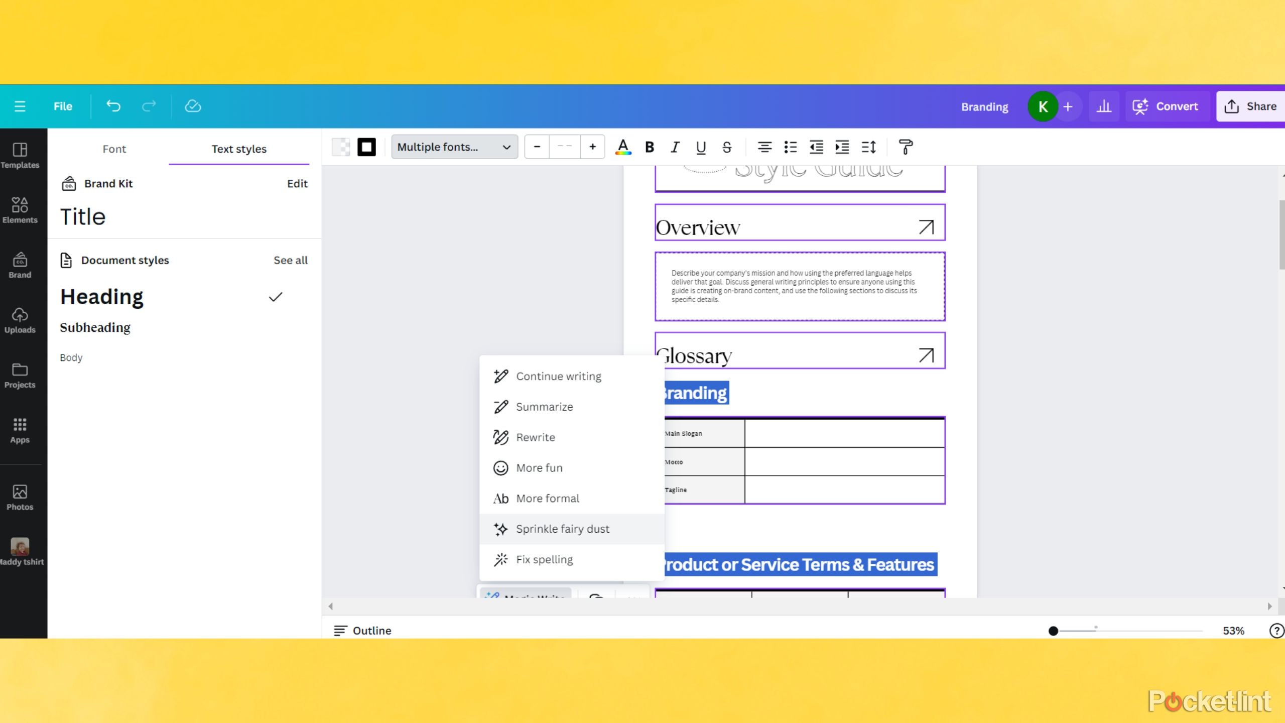
This feature is newer to me, a recent addition to the Canva suite that makes a huge difference in creating, editing, and designing new documents, worksheets, and PDFs. My partner is an eighth grade ELA teacher in New York State, during his qualifications this past year, he used Canva weekly (with some coaching from yours truly) to up his daily slideshows, worksheets, and project planning.
The Doc creator feels much closer to Canva’s attempt at living, collaborative sheets, à la Google Docs. However, where it’s frustrating to insert images in Microsoft Word and Google Docs with formatting jumping all around, Canva is made with image integration in mind, making it ideal for infographics, design boards, project planning and more. You can export easily through the share function as PDF or as Microsoft Word documents for cross-platform needs.
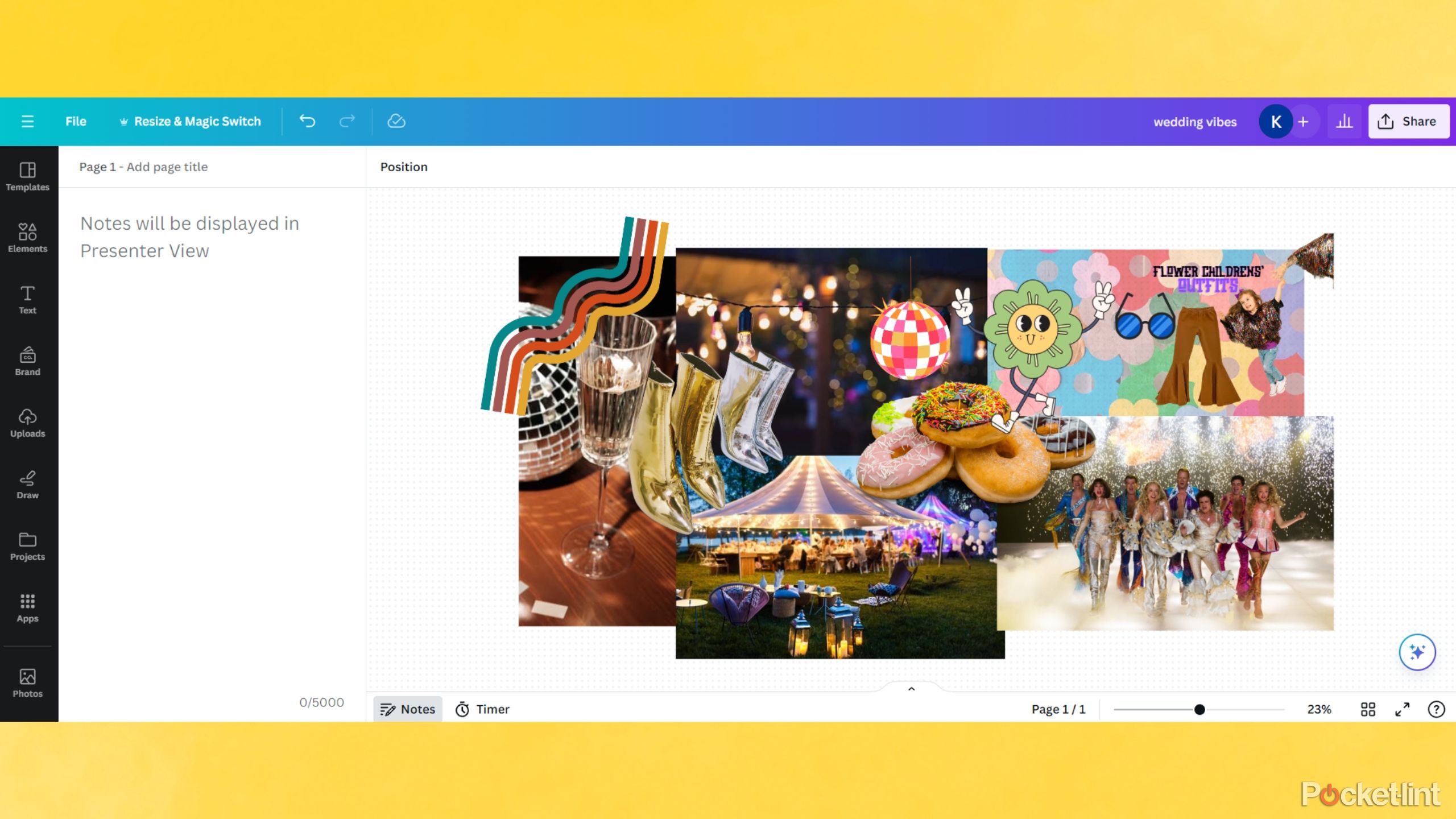
I’m trialing the Whiteboard for wedding planning to have a collaborative space for my fiancé and I to add aspirational vibes…
The other collaborative feature I love is the Whiteboard. It’s another collaborative space that will display multiple users simultaneously making edits, adding reactions, and creating together. Great for planning, designing, and drawing. You can add timers for collaborative workspaces and add prompts for remote discussion. If you have ever used Google’s now discontinued JamBoard — it reminds me a lot of a cleaner version.
This could be my Millennial cheugy-ness, but Canva has always been my top way to make a vision board. I still enjoy making color pallets and mood boards in a standard Canva template, but I’m trialing the whiteboard for wedding planning to have a collaborative space for my fiancé and I to add aspirational vibes and laugh at each other’s ideas. Currently, Mamma Mia theme is winning, and this Whiteboard definitely helped my enthusiastic pitch.

How to scan a document or photo using your iPhone, iPad or iPod touch
A quick step-by-step on how to scan a photo and scan and sign a document using your iPhone, iPad or iPod touch.
7 Magic edits, Background remover and Image Upscaler
Canva Pro is worth it if you can swing it
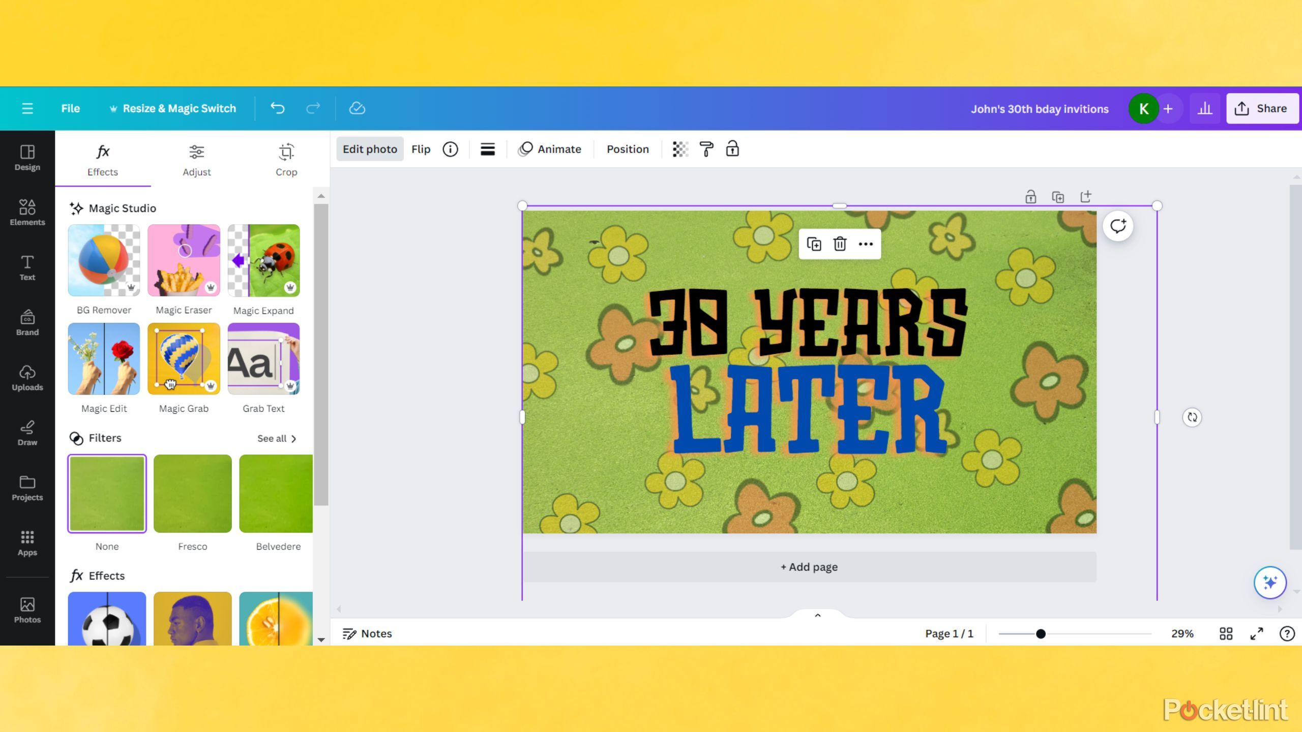
You’ll get some Canva Pro features in a free account, so don’t count yourself out if you don’t have Canva Pro, but most of the Magic suite of editing tools: Magic Erase, Magic Grab, Image Upscaler, Background Remover, etc. are behind the Canva Pro paywall. As Canva rolls out new features, it often allows free accounts to utilize Pro features on a scale, so some features may become available to you over time. Using mostly Canva Pro features, I created a silly Sponge-Bob themed 30th birthday invitation card for my fiancé’s upcoming party, and it took me three minutes from start to finish.
Utilizing apps like BadTV and Liquify to alter the shapes of design elements to make them more original and interesting.
The Background Remover, filters, Magic Grab, and Magic Eraser are other handy tools I use daily when a design calls for a bit more attention than a quick resizing. My newest favorite editing tool is utilizing apps like BadTV and Liquify to alter the shapes of design elements to make them more original and interesting. You will find all of these elements under Edit after selecting an image if you have a Canva Pro account. If you are using Canva Free, select an element and trial out some of the included image editing apps and features too.
The Image Upscaler is a great feature to sharpen and enhance older photos as well as one’s taken in improper lighting. I use it daily to edit some product photos here and there that aren’t up to the proper resolution. Select an image and go to Edit, scroll down until you reach Image Upscaler, choose your upscale level (I don’t tend to go past 2x), and wait for the magic.

The best tablets for graphic design
Stunning displays with a papery feel bring your graphics to life with these tablets for graphic design
FAQ
Q: What are the pricing tiers Canva offers?
- Canva Free is a completely free service for any user with an email to sign up and access.
- Canva Pro costs $120/one user for a year, charged monthly $20/month.
- Canva Teams is priced by the size of your team and discounted from the individual Pro level. Canva Teams is $100/person for an annual account, but you must have a minimum of three users to qualify for a Team account.
For more information and to see current outlines of major differences between the account models, check Canva’s site here.
A few differences between Canva Free and Canva Pro:
- The amount of premium images available for use (1 million compared to over 4 million).
- Full access to some of the bonus editing tools.
- 5GB of cloud storage with Free to 1TB in Pro.
Canva Free currently offers scaled use of about half of the more premium AI editing features. For example, Magic Edit is available for Canva Free users for up to 100 uses daily. The Brand Kit and templates reviewed above are also exclusive to Canva Pro. Look for the small Canva crown next to a feature to tell if its a Pro level feature.
Canva also offers Canva Enterprise for larger businesses, but they do require direct contact for a price. Find more info on the Canva site here for larger business inquiries.
Q: Can I access Canva Pro at a discount or free if I’m a student or teacher?
Absolutely. One of my favorite aspects of Canva is the accessibility across pricing. If you are an educator, a student, or work for a non-profit agency, you may qualify for upgrades to your account to include Canva Pro features at no cost. Check out the guidance here for more information: Canva teachers, Canva students, Canva non-profits.
Trending Products

Cooler Master MasterBox Q300L Micro-ATX Tower with Magnetic Design Dust Filter, Transparent Acrylic Side Panel…

ASUS TUF Gaming GT301 ZAKU II Edition ATX mid-Tower Compact case with Tempered Glass Side Panel, Honeycomb Front Panel…

ASUS TUF Gaming GT501 Mid-Tower Computer Case for up to EATX Motherboards with USB 3.0 Front Panel Cases GT501/GRY/WITH…

be quiet! Pure Base 500DX Black, Mid Tower ATX case, ARGB, 3 pre-installed Pure Wings 2, BGW37, tempered glass window

ASUS ROG Strix Helios GX601 White Edition RGB Mid-Tower Computer Case for ATX/EATX Motherboards with tempered glass…


