Key Takeaways
- macOS is a mature operating system, but there’s still room for improvement.
- Apple is set to announce macOS 15 at its upcoming WWDC 2024 conference.
- macOS 15 would benefit from better window management akin to Windows Snap, the return of Dashboard, and more.
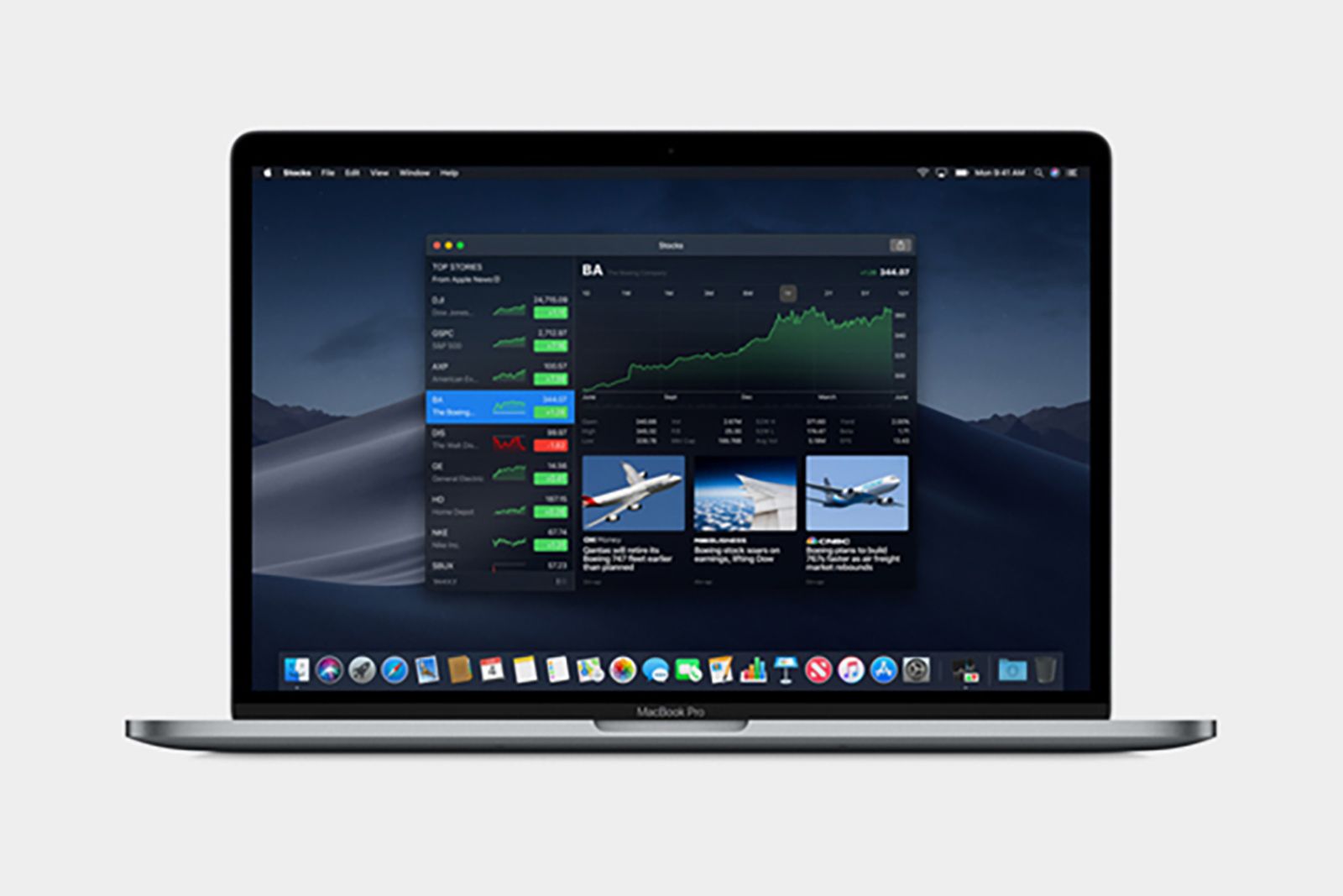
For all intents and purposes, it’s fair to say that macOS is a well-oiled machine. Apple’s Mac product line turned 40 this year, and the company has been steadily iterating on the software side of the equation right from the beginning.
For as feature-rich and mature as macOS has become, I can’t help but feel that the platform is still missing some key features and interface considerations. With WWDC 2024 around the corner, my fingers are crossed that Apple gives the Mac some well-deserved TLC in the form of macOS 15.
Apple macOS Sonoma: All the features now available on your Mac
This is everything you need to know about the latest Mac software update, macOS Sonoma (macOS 14), including features and compatible Macs.
Here are 5 possible macOS additions I’m personally crossing my fingers for.
5 Better window management
Just poach Windows Snap, already.
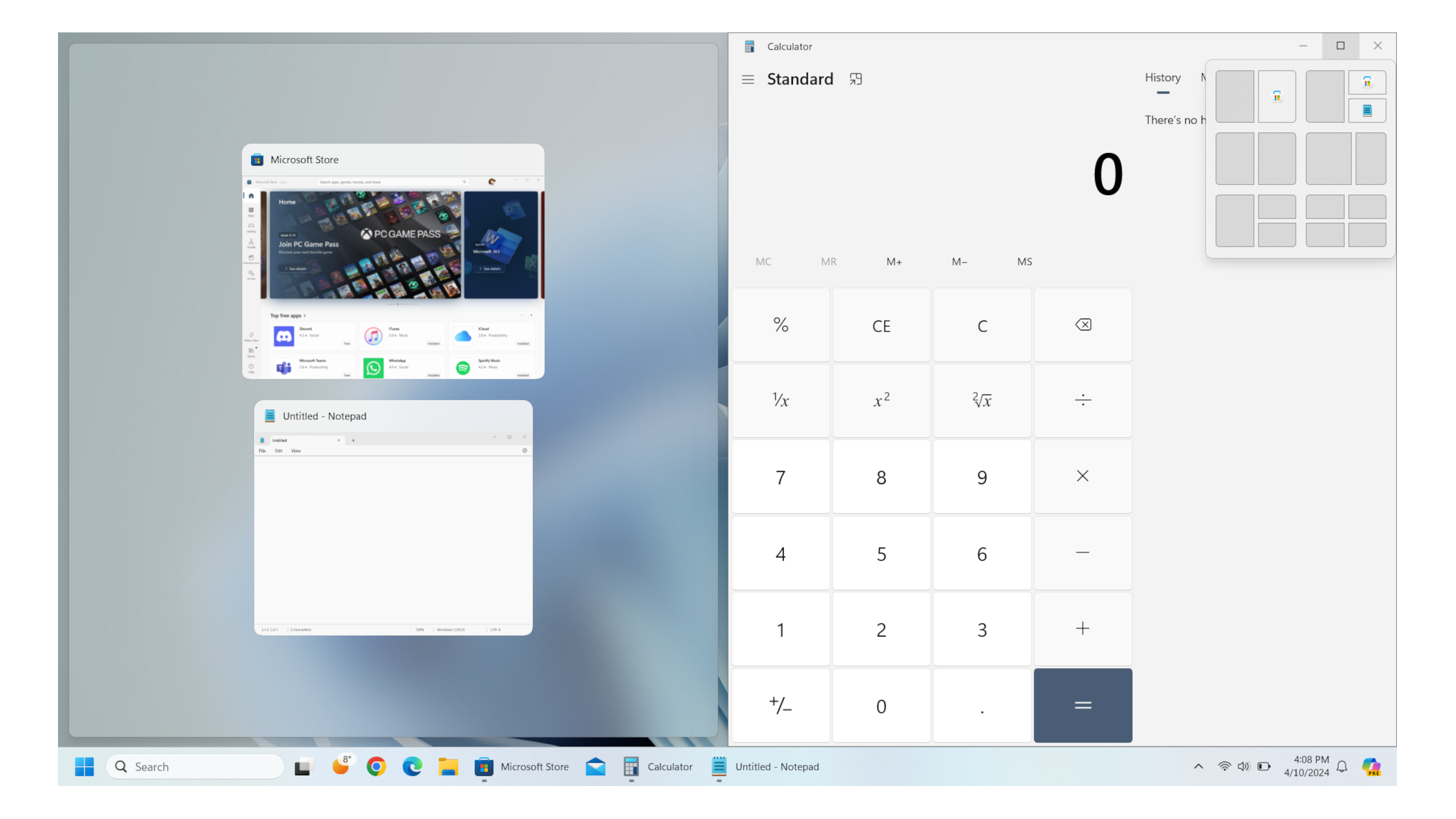
MacOS is notoriously poor when it comes to the manipulation of application windows. A split screen mode has existed for years, but it forces your apps into a full screen setup, and it’s not the most discoverable feature out there.
A better solution already exists — pioneered by Microsoft all the way back with its legendary Windows 7 operating system.
A better solution already exists — pioneered by Microsoft all the way back with its legendary Windows 7 operating system. The idea is that you drag your window to a corner or side bezel of the screen, and the system will automatically snap it into the appropriate quadrant or half layout accordingly. Third-party apps like Magnet even allow you to add Snap-like functionality to macOS.
Apple has had no problem iterating on and implementing features from competing operating systems in the past, and this is one such case where I really hope the company shamelessly steals from its competition.
4 A native volume mixer
A basic feature that should’ve been there from the start
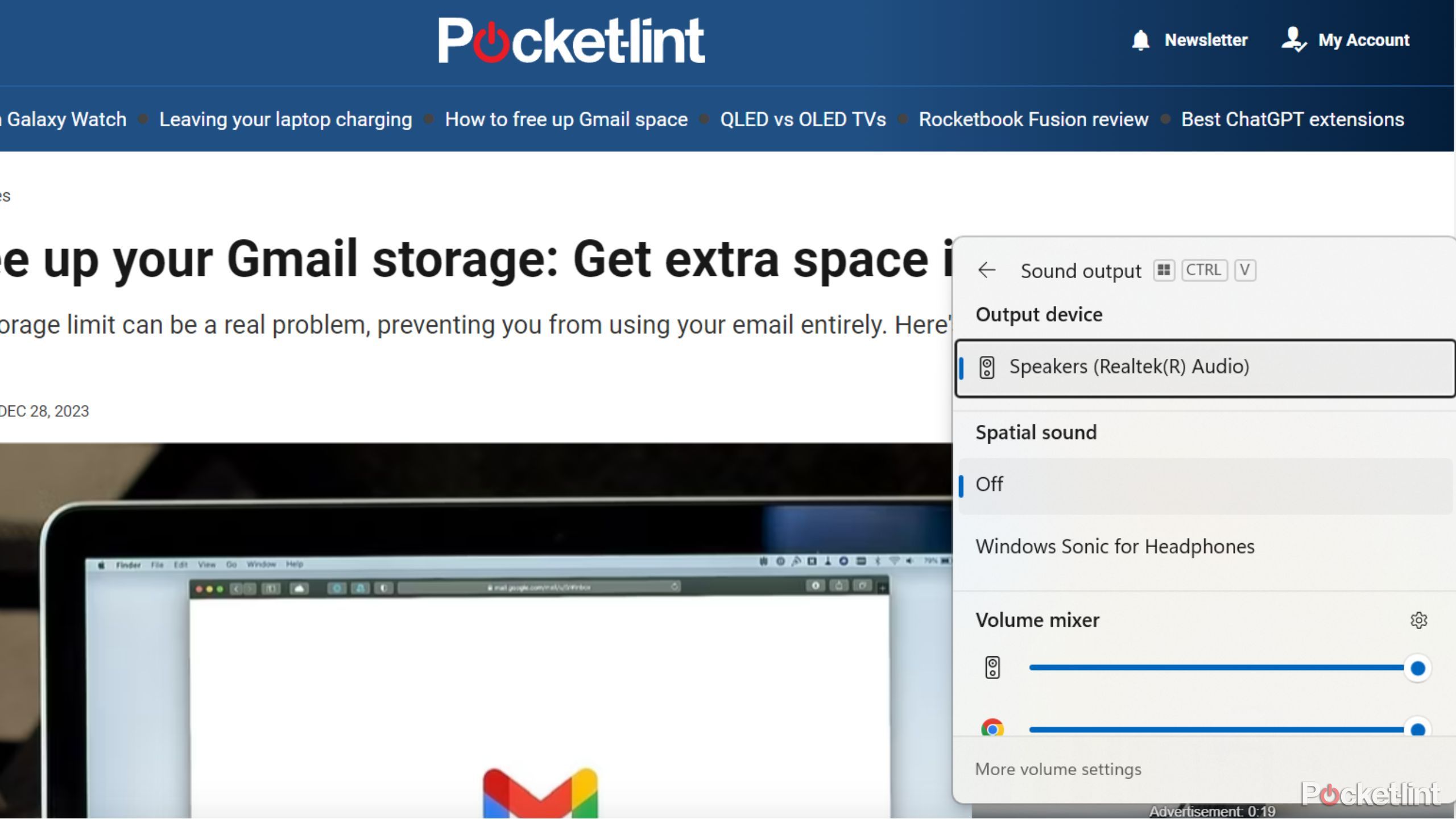
Another Microsoft Windows staple, it caught me off guard when I first learned that macOS doesn’t natively support a per-app volume mixer. Considering how powerful our devices are these days, and how multitasking has become an inherent part of modern-day computing, this missing feature is a sore point indeed.
Out of the box, I’d love to be able to adjust the volume of my Spotify playlist independently of the sound being outputted from my other browser tabs, games, or applications being run in the foreground. It’s one of those features you don’t think you’ll need, until the situation arises where it would undoubtedly come in handy.
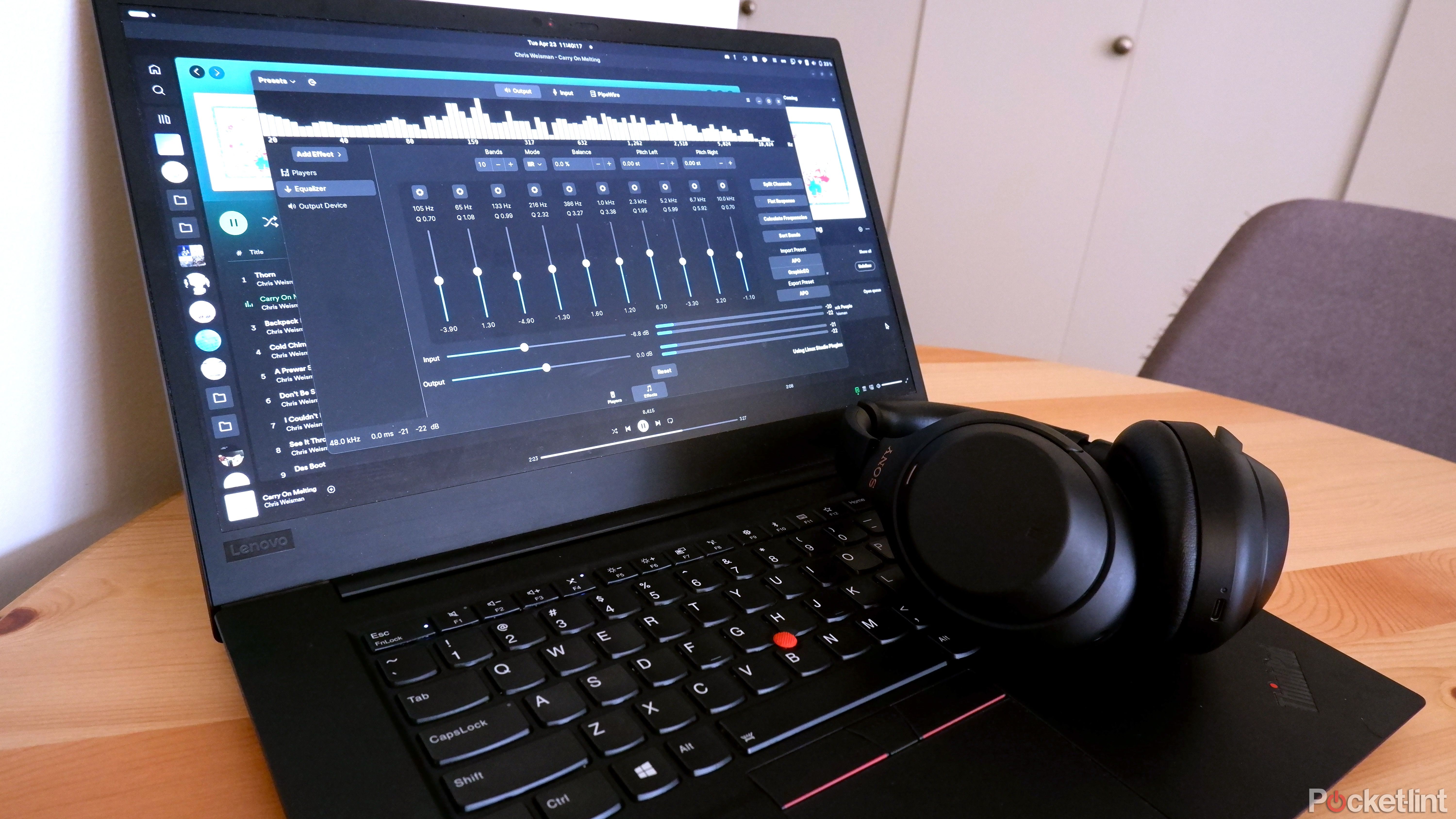
How I use the AutoEq app to get the perfect custom sound
Choose from a database with over 700 headphones’ frequency responses to get ideal sound for your favorite headphones.
3 A reworked System Settings app
Let’s face it — the current layout is a confusing mess
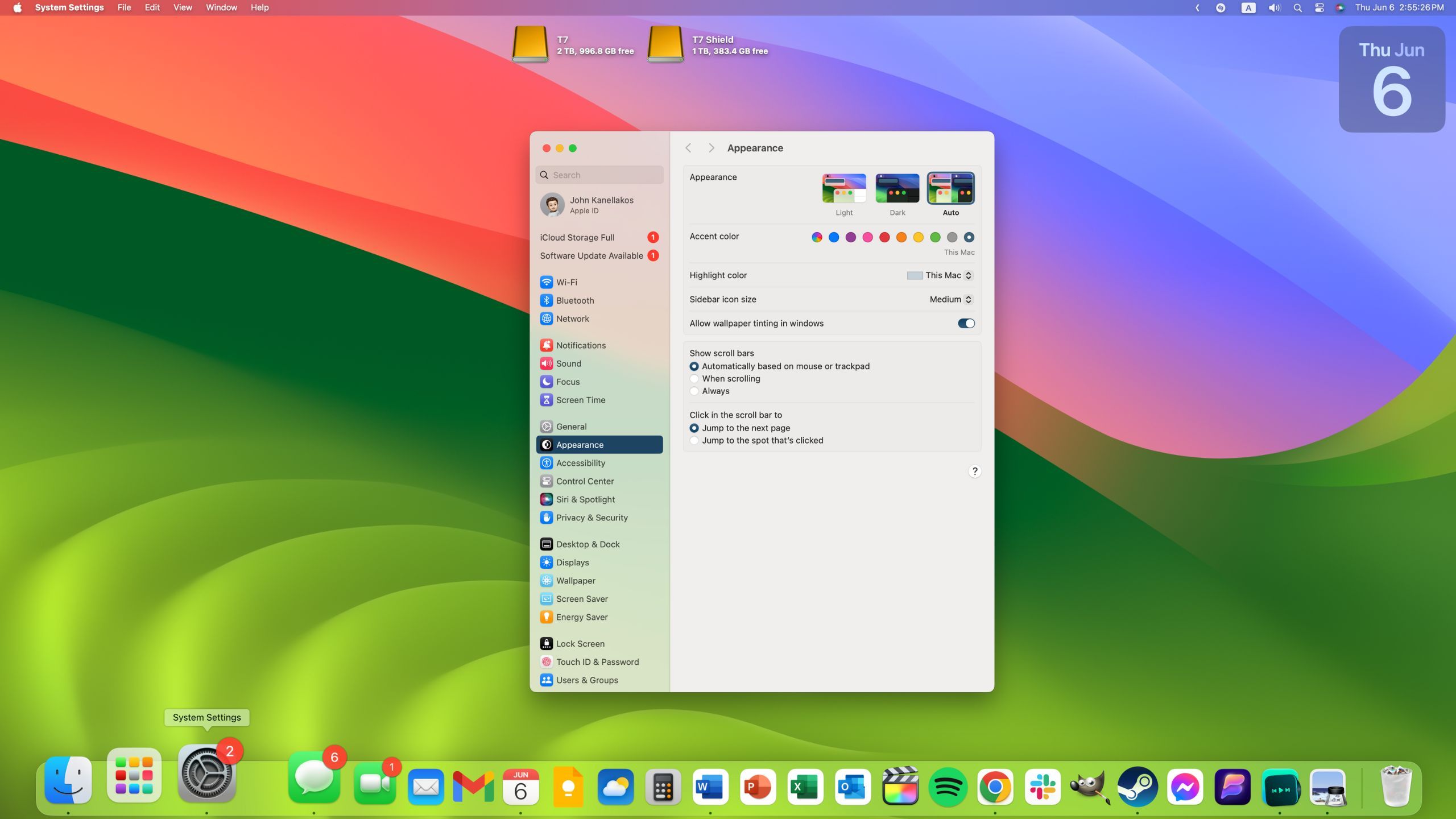
When Apple released MacOS Ventura back in 2022, it brought with it a redesigned interface for settings. Gone was the control panel-esque System Preferences, and replacing it was the iOS-inspired System Settings pane.
I’m all for design consistency when it comes to a company’s portfolio of operating systems, but the new settings interface just doesn’t stand up to scrutiny. Putting aside the loss of years of muscle memory, the sidebar of the new interface and how it’s organized always leaves me puzzled and confused.
I’m all for design consistency when it comes to a company’s portfolio of operating systems, but the new settings interface just doesn’t stand up to scrutiny.
I’d love for Apple to simply provide a toggle to switch between this new interface and the legacy layout on demand. I don’t see the company doing this. However, according to MacRumors reporter Joe Rossignol, Apple will unveil a redesigned Control Center alongside iOS 18 that will all users to customize part of the interface. Perhaps Apple has similar plans for macOS.
2 The triumphant return of Dashboard
A dedicated surface for widgets is absolutely still the way to go
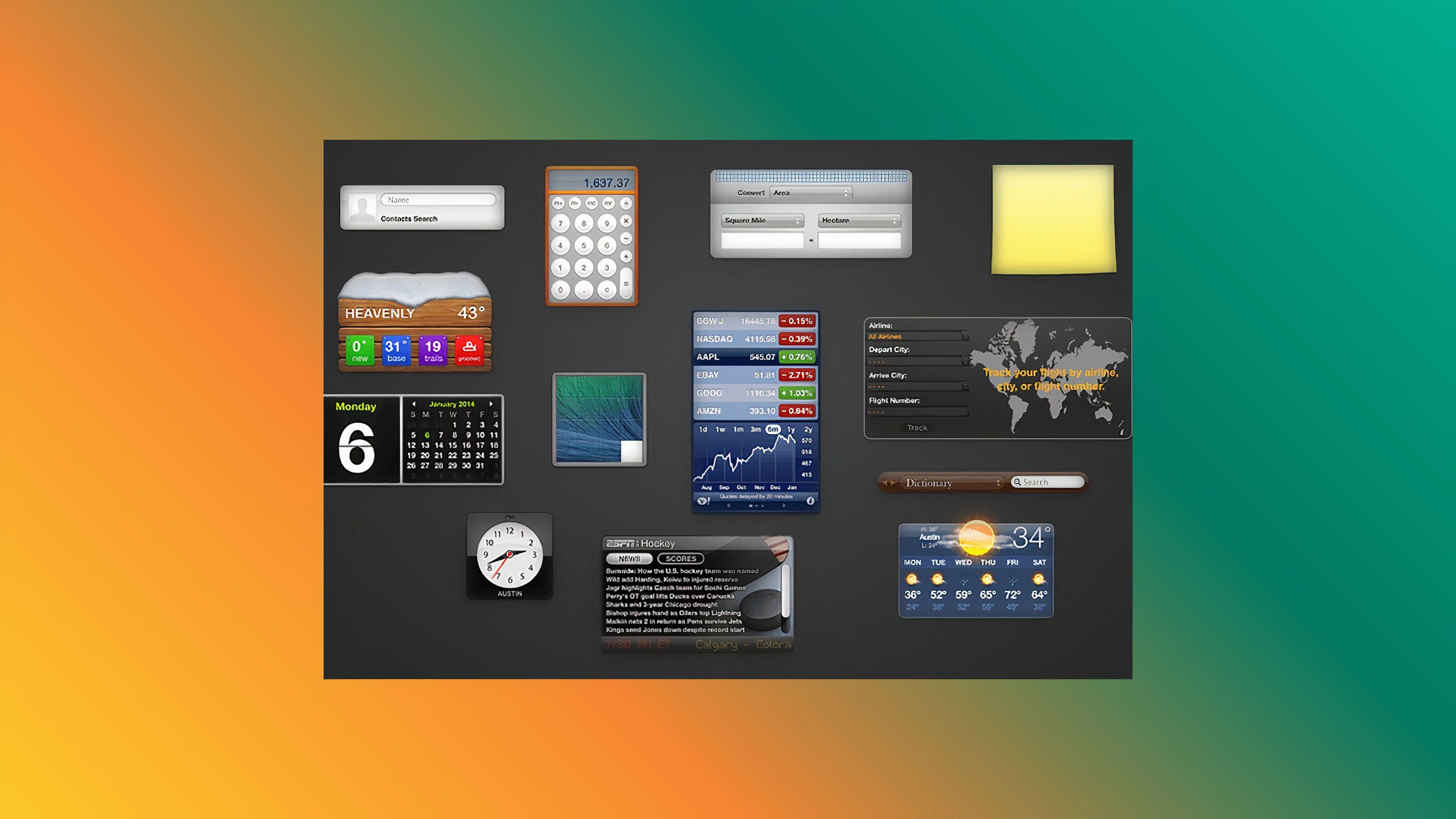
For those old enough to remember, past versions of macOS included a dedicated screen exclusively for pinning widgets. Regrettably, the feature was discontinued in macOS Mojave, and I’ve been yearning for its return ever since.
Sure, these days we can pin widgets directly onto the main desktop screen, but I can’t be the only one who prefers a clean desktop setup with a separate widget-centric screen off the side.
I’d absolutely love it if Apple reintroduced Dashboard to the out-of-box macOS experience, even if the company opted to disable the feature by default. The desktop and sidebar panel both display widgets perfectly fine, but it doesn’t quite scratch my widget-loving itch.
1 A modernized Launchpad
Launchpad is starting to feel clunky when compared to competing solutions
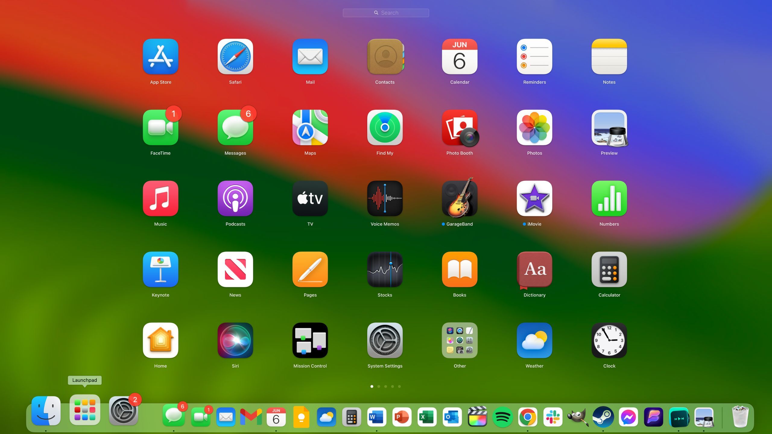
Launchpad serves as the one-stop-shop for finding all your installed applications on macOS. It looks and feels similar to an iOS or iPadOS home screen, complete with a grid of icons and horizontal pagination.
There’s nothing inherently wrong with Launchpad, but I feel that it’s been neglected over the years and could be enhanced in several ways. For example, from an organizational perspective, it’s been eclipsed by Apple’s own App Library feature on iOS and iPadOS.
Other operating systems like Windows and Android have their own native solutions — the Start Menu and the app drawer, respectively — each of which feel more robust and fluid to interact with when compared to Launchpad on macOS. I for one, would welcome a little polish to the feature in macOS 15 with open arms.
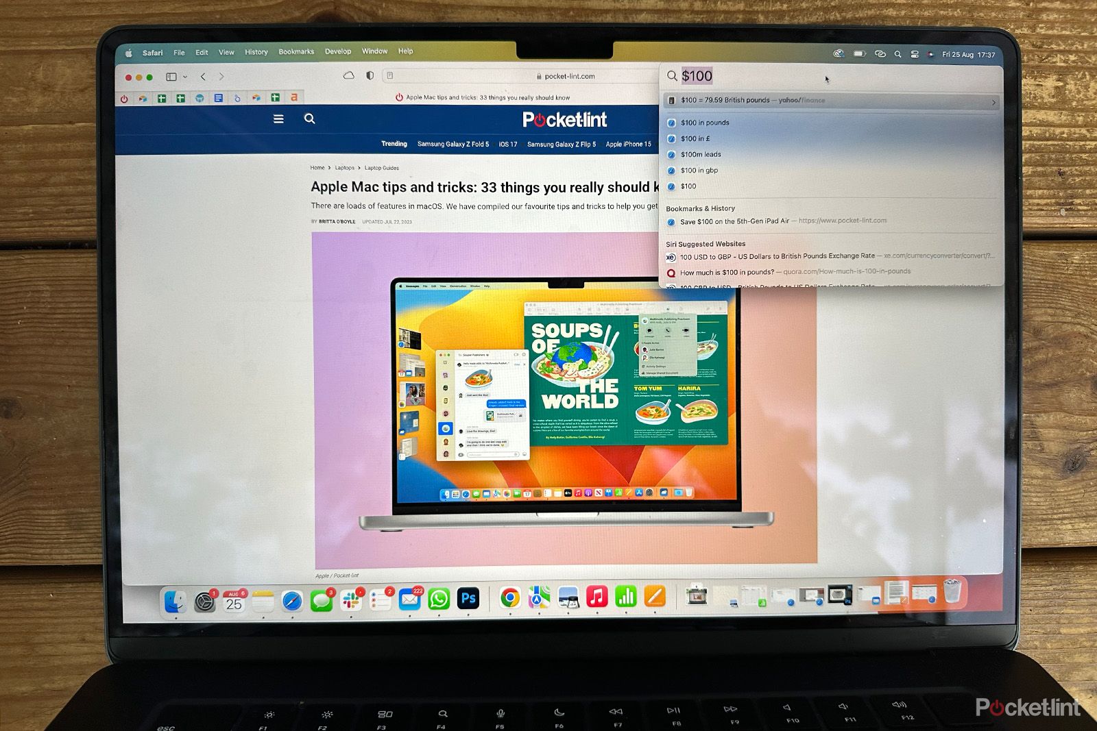
Spotlight is the best feature of macOS: Here’s everything you need to know and the best tips
Spotlight is my favourite macOS feature by a mile. Here’s everything you should know about it and the best tips and tricks.
Trending Products

Cooler Master MasterBox Q300L Micro-ATX Tower with Magnetic Design Dust Filter, Transparent Acrylic Side Panel…

ASUS TUF Gaming GT301 ZAKU II Edition ATX mid-Tower Compact case with Tempered Glass Side Panel, Honeycomb Front Panel…

ASUS TUF Gaming GT501 Mid-Tower Computer Case for up to EATX Motherboards with USB 3.0 Front Panel Cases GT501/GRY/WITH…

be quiet! Pure Base 500DX Black, Mid Tower ATX case, ARGB, 3 pre-installed Pure Wings 2, BGW37, tempered glass window

ASUS ROG Strix Helios GX601 White Edition RGB Mid-Tower Computer Case for ATX/EATX Motherboards with tempered glass…


